Text class TextView
Note
If you are not sure how to modify the general properties of the text, please refer to《General attributes》
I need to display a text/label, what should I do?
If you need to display text, you can quickly implement it with the existing Textview. The specific steps are as follows:
- Double click to open the main.ftu file
- Find the
textcontrol in the right control collection Left-click on the
textcontrol and hold it, then drag it to any position, release the left button, and you can see the automatically generated text control.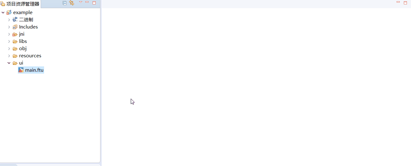
How to dynamically update text content through code?
In the use of the serial port screen, the text content is often updated dynamically. Then in the code, we can dynamically update the content of the text control through the pointer corresponding to the text control. The specific steps are as follows:
- First, you need to know the pointer variable corresponding to the text control in the code(If you are not clear about the corresponding rules of the pointer variable name and the control ID in the UI file, click here), Here takes the text control with ID
Textview1as an example, its corresponding pointer variable ismTextview1Ptr, - If we want to modify the text content of the Textview1 control to
"Hello World", it can be achieved by calling the member method of the text controlvoid setText(const char *text), in the correspondingLogic.ccfile, The specific code is:mTextview1Ptr->setText("Hello World");static bool onButtonClick_Button1(ZKButton *pButton) { mTextview1Ptr->setText("Hello World"); return false; } - In addition to setting strings, the text control also supports setting number and character:
/* For interface definition, see the header file: include/control/ZKTextView.h */
void setText(int text);  // Set number
void setText(char text); // Set character

/* Operation example */
mTextview1Ptr->setText(123); // Textview1 control will display the string "123"
mTextview1Ptr->setText('c'); // The Textview1 control will display the'c' character
How to modify the color of text?
The default text is displayed in white, which usually cannot meet the requirements. You can modify the text color in the following two ways.
Modify the color of the control directly in the property bar
In the project explorer, select a UI file and double-click to open it; On the preview interface, find the control you want to modify, left-click on it, and you can see the corresponding attribute table of the control on the right side of the editor. At this time, you can fill in the custom attribute values as needed. As with Excel, find the attribute you need to modify, and then click Modify.
In the text control, you can see that there are 3 table items related to the color attribute, namely
- Color setting
- This property can set the color value of the text in each state of the control separately
- Background color
- Set the background color of the entire rectangular area of the control (will not change according to the state of the control)
Background color setting
- To extend the background color property, you can set the background color in each state of the control separately
Specific examples:

Effect picture:

The above figure is a screenshot of the color part of the attribute table. The meaning is: the background color is set to black, and the text color is set to white. When the control is set to the selected state, the text color changes to red.
Control color change through code
Setting the color in the attribute table is intuitive and convenient, but it lacks flexibility. Therefore, in the code, the color can be dynamically controlled by calling the corresponding member method through the control pointer.
Take the text control with ID Textview1 as an example, the following methods can achieve the purpose of modifying the color.(If you are not clear about the corresponding rules of the pointer variable name and the control ID in the UI file, click here)
Take the text control with ID Textview1 as an example, the following methods can achieve the purpose of modifying the color.
void setInvalid(BOOL isInvalid)/*Set the control Textview1 to the invalid state; if the `color when invalid` property in the property sheet is not empty, set it to the specified color, otherwise there is no change. */ mTextview1Ptr->setInvalid(true);void setSelected(BOOL isSelected)/*Set the control Textview1 to the selected state; if the `color when selected` property in the property sheet is not empty, set it to the specified color, otherwise there is no change. */ mTextview1Ptr->setSelected(true);void setPressed(BOOL isPressed)/*Set the control Textview1 to the pressed state; if the `color when pressed` property in the property sheet is not empty, set it to the specified color, otherwise there is no change. */ mTextview1Ptr->setPressed(true);void setTextColor(int color) //The parameter color represents the RGB color in hexadecimal//Set the control Textview1 to red.。 mTextview1Ptr->setTextColor(0xFF0000);
How to display decimals
The text control provides an interface for setting string.
    /**
     * @brief Set string text
     */
    void setText(const char *text);
If you want to display any number, you can first use the snprintf function to format the number into a string, and then set the string to achieve the purpose of displaying content at will.
E.g:
  float n = 3.1415;
  char buf[64] = {0};
  snprintf(buf, sizeof(buf), "%.3f", n); /*Fixed display 3 decimal places, extra decimal places will be ignored, if not enough, 0
  will be added*/
  mTextView1Ptr->setText(buf);
snprintf It is a C language standard function, you can search for relevant information on the Internet, or check thebrief introduction and usage examples here。
Realize frame-by-frame animation
Since the text control can add a background image, we can use it to simply display a picture.
One step closer, if we dynamically switch the background image of the text control in the code, as long as the switching time interval is short enough, the animation effect can be achieved.
Picture resource preparation
A smooth frame animation necessarily requires multiple image resources. Here we have prepared a total of 60 photos.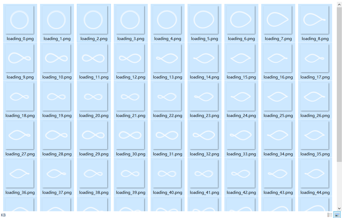
You can see that each picture represents a frame and is named uniformly according to the serial number, which is mainly to facilitate subsequent use.
Note: The system will consume more resources when loading pictures. In order to run the interface smoothly, it is strongly recommended that the pictures should not be too large. For example, the size of a single image in the example is only about 5KB
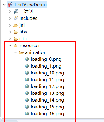
Copy these pictures to the resources directory of the project. You can create subfolders under the resources directory to facilitate the sorting of various image resources.
Create a text control
Create a text control arbitrarily in the UI file. And set the background image of the text control to one of the images. Here I set the first picture as the background picture. This step is just to automatically adjust the width and height of the text control to the width and height of the picture, you can also choose not to set it.
The complete attributes are shown in the figure: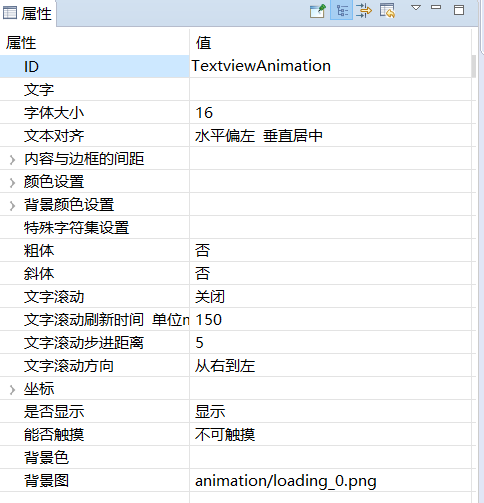
Compile the project, register the timer
After adding the text control, compile the project again, register a timer in the generatedLogic.ccfile, and set the time interval to 50 ms. We use the timer to switch a picture every 50ms.
How to compile the project?
How to register the timer?Dynamically switch the background of the text control
In the correspondingLogic.ccfile, add the following function to switch the background image, and call it in the timer trigger functionbool onUI_Timer(int id).static void updateAnimation(){ static int animationIndex = 0; char path[50] = {0}; snprintf(path, sizeof(path), "animation/loading_%d.png", animationIndex); mTextviewAnimationPtr->setBackgroundPic(path); animationIndex = ++animationIndex % 60; }We need to pay attention to two points in the above function:
- Switching the background image of the text control is implemented by the
setBackgroundPic(char* path)function. The parameter of
setBackgroundPic(char* path)function is the relative path of the picture. The path is relative to theresourcesfolder in the project.For example: as shown in the figure below, our picture is placed under the folder
resources/animation/in the project, then the relative path of loading_0.png isanimation/loading_0.png
The setBackgroundPic(char* path)function can also accept absolute paths. For example: if you put the imageexample.pngin the root directory of TF, its corresponding absolute path is/mnt/extsd/example.png, where/mnt/extsd/is the link of the TF card Load catalog.
We recommend that all image resources be placed in the project'sresoourcesfolder or its subfolders, because image resources in other paths will not be automatically packaged into the software.
- Switching the background image of the text control is implemented by the
Download and run,View effect
- Complete sample download
Use of special character sets
We know that, according to the definition of asc code, there is a correspondence between character char and integer int. For example, the asc code of the character 0 is 48. The special character set is a function of mapping the asc code to the picture. After setting this function, when we display a string, the system will try to map each character in the string to a specified picture, and finally display a string of pictures on the screen.
Setting method
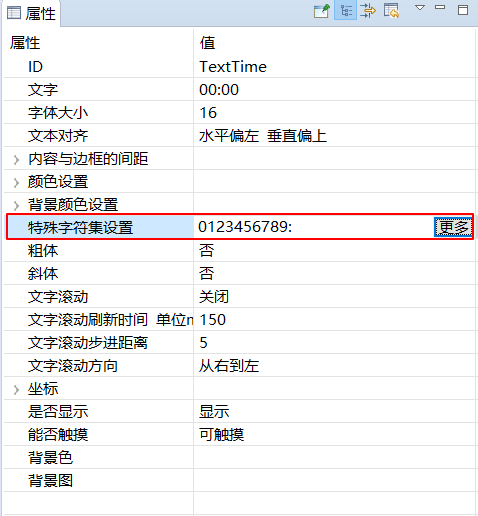
Find the Special Character Set Setting in the text control, click on the More option on the right, a special character set selection box will pop up.

Select the import button in the upper right corner to add the picture to the character set. After adding the picture, you can modify the corresponding asc code or character as the mapping character of the picture. Then click Save
- If you want to verify whether the special character set is added successfully, you can modify the text, and the preview effect will be synchronized on the preview.
Note: If you set a special character set, the system will try to map each character to a picture specified in the character set; if a character is not set to a picture, then this character will not be displayed on the screen.
Specific use
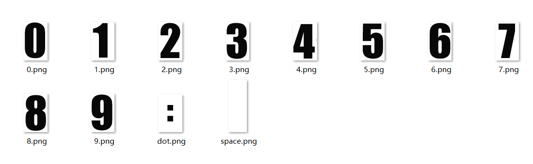
In the above special character set setting box, we have mapped the characters 0-9 and: colon to pictures respectively.
Then in the code, set the string through the
setText(char* str)function. Since we set a special character set in the TextTime text control, the characters are converted to corresponding pictures. The renderings are as follows:static void updateTime() { char timeStr[20]; struct tm *t = TimeHelper::getDateTime() sprintf(timeStr, "%02d:%02", t->tm_hour, t->tm_min); mTextTimePtr->setText(timeStr); }
If you only need to display a single character, you can directly set the asc code or character without converting it into a string.
E.g:mTextTimePtr->setText((char)48); //Set the asc code directly, it needs to be converted to char mTextTimePtr->setText('0'); //Set characters directly
Sample code
As there are many properties of text controls, please refer to the TextViewDemo project in Sample codefor more property effects.
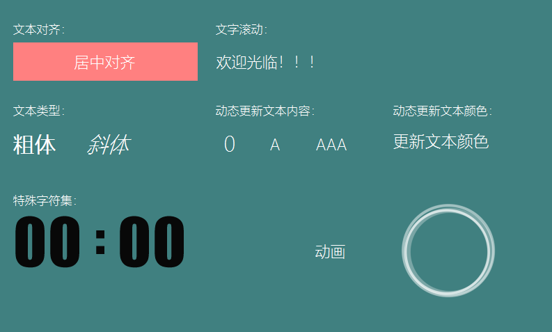
Preview effect picture: